|
|
An Appreciation: the Graphic Designs of Karen Reynolds
Stacie Birky Greene
Over the more than 50 years of her partnership with Roger Reynolds, Karen Reynolds (née Hill) has contributed more to Roger’s career than can be properly accounted for in this space. Her work as a flutist was the catalyst that sparked an enduring relationship, but her attention to detail and her innate understanding of the importance of the moment (coupled with a keen sense of design) were central in establishing a visual language that would express the force of ideas behind Roger’s music.
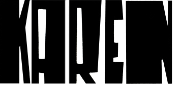
The project began in 1963, when the Reynolds were informed that C.F. Peters was preparing to publish Roger’s music (an arrangement that continues to this day). It was Karen who determined the need to produce a signature approach to the score covers that would immediately distinguish Roger’s work. She set about fashioning a font that features idiosyncratic block lettering, formed by carefully cutting black construction paper with razor blades. The striking results were featured on a dozen Peters publications, as well as LP and CD releases on CRI/New World, Neuma, Mode, and Pogus discs.
Having mastered the art of visual branding, Karen turned her attention to promotional materials that celebrated festivals that she and Roger were involved in organizing, first in Japan (the “CROSS TALK” festivals from 1966-68) and, more recently, the John Cage Centennial Festival in Washington, DC, which the Reynolds directed along with Steve Antosca in 2012. Along the way there were other occasions she felt required special attention: residencies at UCSD by Xenakis and the Arditti Quartet, Roger Reynolds’ massive “Sanctuary” project, and many more.
There are several things to mention about these works, both regarding the composition of the images and the techniques employed to realize Karen’s vision. The summary poster for the Cross Talk series is an interesting example that shows a continued fascination with the capacity of letters themselves to produce fascinating images. Perhaps referencing Cy Twombly and Jasper Johns – artists who both the Reynolds admire – the stenciled letters flow across lines, blurring the boundaries between visual objects and semantic bundles. It is a work of startling sophistication given its simplicity: there are no added elements, only text.
Karen has used a variety of tools to produce her work, evolving, over the years, from silk-screened to completely hand drawn to montage to digital media. The poster for the Cage festival marked a return, of sorts, to the use of text alone, this time done by hand in an acrostic formed from the names of the participants with the text “John Cage Centennial Festival Washington DC,” as a sly homage to one of Cage’s favorite forms – one that also happens to be a favorite pastime of Roger and Karen.
In 1994 Karen began experimenting with inked, gridded, contrasting color field studies. She used this approach for several posters and CD covers, most recently for a Neuma release of the collected “imAge/imagE” pieces, this time paired with her unique font.
It seems that Karen has combined a most peculiar range of capacities in her work: a musician’s understanding of time and of the particulars being referenced, the visual literacy of an avid observer of contemporary art and design, the strategic vision of a publicist in recognizing the degree to which an event might attain special status, and a curator’s caring attention to the way that Roger’s work is presented. This work continues, as ever, in a myriad of ways, always essential, but often understated.
Reprinted by permission from the book "Tributes to Roger Reynolds" ©2019 by Adam Greene
Stacie Birky Greene is an artist and educator living in Southern California. She holds degrees in Art and Art History from the University of Kentucky and studied Graphic Design at the Chicago Art Institute. She has worked with Karen Reynolds with the design and management of informational websites for Roger Reynolds (www.rogerreynolds.com) and the John Cage Centennial Festival at Washington, DC (www.johncage2012.com).
Article
©2019 Stacie Birky Greene
|

